 This chapter introduces the basics of color theory, choosing color schemes that work, and good practice when dealing with color on the Web.
This sample is taken from Chapter 2: "Colors" of the Glasshaus Title "Web Graphics for Non-Designers"
This chapter introduces the basics of color theory, choosing color schemes that work, and good practice when dealing with color on the Web.
This sample is taken from Chapter 2: "Colors" of the Glasshaus Title "Web Graphics for Non-Designers"
![]()
![]()
![]()
![]()
![]()
![]()
![]()
![]()
![]()
Color performs a significant function in our world, providing an effective means of communicating a message. The skin markings on animals, and interpretations of these, influence thinking and alter actions. In everyday life, the color of lights, signs, and other signals give us compelling directions. On the Web, circumstances are much the same.
"color is a sensation and not
a substance."
History of Color Photography (1947)
Joseph Friedman
In the hands of a web designer, color is a powerful tool. With a grounding in fundamental color theory, it is a competitive advantage and an asset to clients. Strong reactions to color from the audience of a site can assist in such things as brand confidence, sales growth, and readership. Attaining or improving on these crucial goals can bring promotions, awards, and referrals of new clients.
A well-considered color scheme is frequently the difference between a reasonable web site and a great web site. It can also mean the difference between a great site and an unusable site, if the scheme used is too outrageous. To ignore the benefits of intelligent use of color is to limit youself as a professional, and to also limit the sites that you produce.
Color branding is a distinct afterthought for a great number of sites on the Web today. While for the vast majority of sites there is not always the budget, time allowance, or skill available to devote an army to brand management, ensuring that your color choices are inline with the style and goals of your branding is a quick and straightforward step forward that should not be ignored.
For some with a background in artistic pursuits, harmonious color selection comes instinctively, while for others it can be an unnatural process. The following guide to basic color theory and color schemes will give the uninitiated a chance to catch up. Also in this chapter, you will learn how to choose an appropriate color scheme and how to use color on the Web (and the various traps to watch for), as well as the importance of color consistency.
With this knowledge, and drawing inspiration from everyday life, creating attractive sites is achievable.
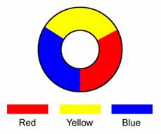
At the heart of basic color theory lie the three Primary colors: red, yellow, and blue:
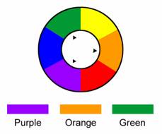
Combining these gives the Secondary colors of green, orange, and purple:
Subsequently, going a level deeper and the combination of a Primary and Secondary color gives us the Tertiary colors of red-orange, red-purple, blue-purple, blue-green, yellow-green, and yellow-orange:
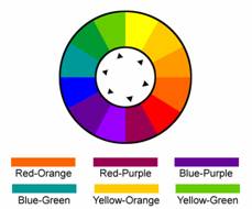
Tertiary colors are a form of intermediate colors, which are the result of further combinations from the color wheels presented. A color wheel shows these hues (as you will learn soon, a hue is a pure color) from which every other color is created.

Every other color available for use on the web is a variation in tone, tint, or shade, each of which you will learn more about shortly. Combining natural hues with the neutral colors black and white (and the grays in between), gives these variations. From the definition of a hue that follows, you will learn that these neutrals have no hue.
Hue: A hue is a pure color with no black or white added. It is the feature of a color that allows it to be identified as, say, red or blue:
![]()
Intensity: Also known as saturation or chromaticity, intensity describes the identifiable hue component of a color. A blue with RGB (0,0,255) is considered intense (or completely saturated, and high in chromaticity) and 100% saturated. A gray, however, has no identifiable hue, and is termed achromatic with 0% saturation:
![]()
![]()
Shade: A shade is a hue with black added:
![]()
Tint: A tint is a hue with white added:
![]()
Tone: A tone is a hue with gray added (tending towards neutrality), or a hue with some strength of its complementary color added:
![]()
The results of adding a hue to its complement generally appear richer than the addition of straight neutrals:
![]()
![]()
RGB and CMYK: RGB and CMYK are color spaces relied upon by designers every day. The RGB space, representing red, green, and blue, will be the most familiar to web developers. Understanding the two, though, is as easy as comprehending the differences. RGB is additive color used by electronic displays (and curiously, the human eye) where red, green, and blue light creates the colors we see on screen. The default black you see on screen is simply a deficiency of all of these colors. Conversely, combining the three gives white.
CMYK, on the other hand, is subtractive and standard in the printing industry. A blank page, for example, is white and reflects all colors. Adding cyan, magenta, and yellow to the page actually subtracts from the light reflected. Combining cyan, magenta, and yellow does not give black, and so black is added independently. It is represented as the letter K.
Due to limitations of printing with ink, the CMYK color space is actually smaller than that of RGB. Photoshop, for example, has the ability to warn you of colors in the RGB space that will not survive a conversion to CMYK. As such, when converting from RGB to CMYK, some colors are lost (you may have seen Photoshop's "out of gamut" warning which is telling you that this is occurring). Nonetheless, for the most part web developers will not need to step outside of RGB, other than to occasionally convert corporate color values, and should not be troubled by this.
Alpha: The term "alpha" refers to a further value within a color definition, and determines transparency. As you may be well aware, a GIF provides support for transparency, but the value at a given pixel must be either fully transparent or opaque. Forward-looking formats such as PNG provide better alpha bearing, but are not as supported by browsers as the GIF and JPEG formats.
![]()
![]()
![]()
![]()
![]()
![]()
![]()
![]()
![]()
 George Petrov is a renowned software writer and developer whose extensive skills brought numerous extensions, articles and knowledge to the DMXzone- the online community for professional Adobe Dreamweaver users. The most popular for its over high-quality Dreamweaver extensions and templates.
George is also the founder of Wappler.io - the most Advanced Web & App Builder
Comments
Great Tutorial!
I want to add it to my favorites but I can't find a way to do it!
Thanks!
Cecilia
RE: Great Tutorial!
RE: RE: Great Tutorial!
Great Tutorial
You must me logged in to write a comment.