Be the first to write a review
Free! - Not Just Another Image Gallery
My first thought when I look at a typical Flash tutorial is usually that I wish Flash authors would really write the article. Don't throw tomatoes yet .. there are some very good articles and tutorials out there and I'm not talking about those. But the majority of Flash related pieces follow the same basic recipe. Create a document, drag this in, do this and then this; then copy this code and paste it in and test the movie. There you're done. Isn't it fabulous?
Yeah, great .. what did I do? I can now probably create the same thing the author did, but what else can I do with it? Why didn't you show me how to take this thing and run with it as far as my imagination can take me? That's what I hope this article will be about. FLzone has created something that is very easy to use and with a very small amount of code, one can create a pretty eye catching 3D Image Gallery. It's pretty cool right out of the box, but it's also very extendable and my aim with this article is to teach you what it can do and at the end, show you a couple of examples of what you can do with it. After that, it's up to you and your imagination.
Example 1: Image Gallery
It has always been my opinion that the best way to learn something new, whether it be coding related or something like a musical instrument, is to get in there and work with it. The easiest way to explain the 3D ImageFlow Gallery for Flash is to show you what it is, what it does and how to use it. So let's dive into Flash CS3 and walk through the interface. The zip files that accompany this article have a folder called "flowers" which contains an "images" folder with five pictures of flowers for use with this portion of the article. Your Flash document and other files will go in the main flowers directory.
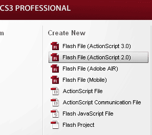
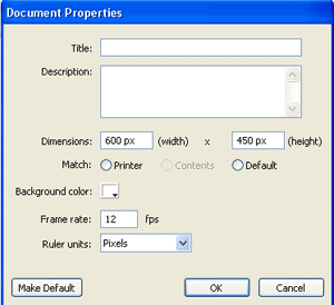
The 3D ImageFlow Gallery is an ActionScript 2 Component so we'll start out by creating a new document in Flash and make sure to select ActionScript 2, as shown in Figure 1. Save it as something meaningful (I used mygallery.fla) and store it in the directory with the images you're going to be using. The next step is to make the document the size needed for your project. My gallery is going to be full width in the browser so I'm making the Flash Document 600 pixels wide by 450 pixels high, as shown in Figure 2.
Figure 1: Make sure you create an ActionScript 2.0 Flash File |
Figure 2: Set the document properties to the Desired height and width for your project |
Now drag the ImageGallery 3D component to the stage. If you've left the Flash document white like I did, you will see this big black thing and think "hmmm" for a minute. That's the default look and you probably won't be keeping that for long. Give the component on the stage an instance name and size it as you wish. I made it the size of my document and set both the X and Y starting points on 0. Now let's explore the options available with this thing and I think you'll start to see the possibilities.
Select the component instance on the stage and open the Component Inspector. I stretched mine out and took the picture on the right so you could see just how customizable this component really is. You probably won't use all the options much of the time .. although you could .. but depending on your use, you can see that the possibilities are virtually endless. The values pictured for each parameter are the defaults and changing some or all of them greatly changes how your display looks. The first thing you will notice is that the parameters are organized into sections that allow you to customize each aspect of your gallery in an orderly fashion. The first three settings set the animation and determine the flip appearance from picture to picture. You can set autoflip to true and automate your gallery like a slideshow, or leave it to false and click on the pictures to change them. You can change the interval and animate the change. The next group of settings have to do with the component itself. You can set a background color or remove it completely by setting backgroundTransparency to true. You can set description colors, fonts, size and strength. You can determine the image Angle, Depth, Height, Quality and space the images however you wish. You can set reflections on the images or eliminate them by setting that to false. If you like them, you can determine their size and strength. In the next group, you can set options for the title just like you did the descriptions and then, you can specify an xmlpath to feed the images from an xml document rather than using ActionScript to list them. At the bottom you can set enabled or visible to false and hide the whole thing, but I haven't quite figured out why one would do that. Let's just leave those set to true and have some fun. |
|
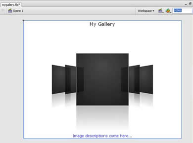
The first setting I would change is setting the backgroundTransparency to true. Immediately, that huge background thing is gone and now you're left with the image placeholders that show you what the gallery will look like. This step makes it a lot easier to work with the other settings. If you decide you want a colored background, you can always set it transparency back to false later.
The next thing I did is set a color for the title and descriptions. If you used default white for your flash document, you are probably asking "what title and description"? Took me a couple of minutes to realize that the component defaults for title and description font are also white so change those to something you can see and boom .. you have a title (once you put something in titleText) and a placeholder description that you will be replaced with the description of each picture.

Image Gallery with background set to transparent
and a color set on title and dexcription
At this point in time, I would advise you to save the document to give you a good starting point and then just play with some of the other settings in the component. You can change them back so don't be afraid and if you can't remember the original settings, then just close the document without saving it and reopen it to get back to your starting point as shown above. Play with the image angles, depth, size, etc. until you have just what you want. From there, it's just a matter of displaying the data, which most of the time will be images.
Nancy Gill
 In early 1996, Nancy Gill picked up her first book on HTML and permanently said goodbye to the legal field. She has been busy ever since developing web sites for businesses, organizations and social groups in Central California and occasionally beyond. Nancy has served as a member of Team Macromedia since late 2001, first with UltraDev and then moving to Dreamweaver when the programs were consolidated in 2002. She also serves as Assistant Manager for the Central California Macromedia User's Group.
Nancy is the co-author of Dreamweaver MX: Instant Trouble-Shooter and technical editor for several Dreamweaver and Contribute related books, including the well-known Dreamweaver MX 2004: A Complete Reference. She also penned the first ever Contribute article for Macromedia's Own Devnet "Getting Up to Speed with Contribute in 10 Minutes".
Nancy has three children, two in college and one in high school. Offline, she enjoys various sporting activities, is a wild NFL football fan and sings in the church choir.


