Be the first to write a review
WordPress and Graphics
Placement, colour and resources on finding images for your blog.
Are you ready to add images to your WordPress blog? This tutorial can help you with your decisions on how to use images in your blog before you begin to upload images. Linda talks about placement, colour and resources on finding images for your blog.
Why Use Graphics?
You can be a purist and use text only in your blog. You can accomplish this, and if you are a fantastic writer or a famous person, you can gain a lot of readership. But, readers like to look at pretty pictures, and some blogs beg to be dressed up. The issue here is to keep those graphics at a minimum so that your site downloads quickly and easily. And, another issue is to use relevant images so you won't anger your readers with irrelevant images.
When you use WordPress (WP), even the default layout contains images. Even simple themes such as Theme Hybrid contain some small images. While these sites can load quickly and easily into a multitude of browsers, the image is what you may need to catch a viewer's eye.
Above the Fold
I worked as a journalist for some years, and my boss was a man after a marketing person's heart. Although the town we lived in contained only 4,000 people, and the paper was the only print newspaper in town, he maintained that a photo placed "above the fold" was the best way to sell ALL the papers he had printed.
"Above the fold" means that an image showed at the top of the newspaper after it was folded and ready for a newspaper stand or box. My boss's preference was a photo of a "kid, a flag or a dog," as those images sold the most newspapers in his situation. Our audience consisted of patriotic farming families, so those images did, indeed, work.
"Above the fold" in a Website consists of that area that a viewer sees when he or she stumbles upon or searches for your site. If you are appealing to patriotic farming families, then you might search for images of kids, flags and dogs. If you plan to appeal to a different audience, then you need to decide how you want to present your site to that audience. Here are a few examples of striking images used 'above the fold' on Web sites and blogs:
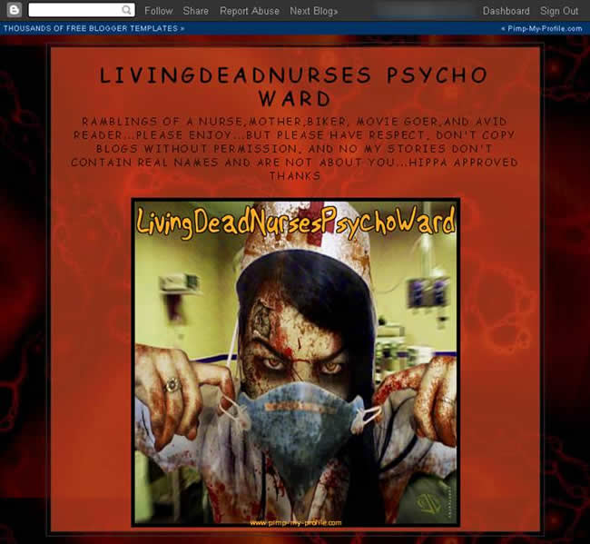
The Google Blogger blog above belongs to a nurse who works in a hospital, not a psych ward. She often feels she's going psychotic from her work, however...and, as a motorcycle-riding mum who loves dogs (she owns eight of them), this image fits her world view at this time. Anyone who might stumble upon her blog at LivingDeadNurses Psycho Ward might be startled enough to start reading.
The use of the colour red in this site connotes both excitement and dread, as red symbolizes danger and sensuousness. Considering the proliferation of vampire novels and television shows, the blood might appeal to anyone who loves that genre. On the whole, however, this nurse is basically sane and practical. She did a great job in snagging some attention with her graphics, though...
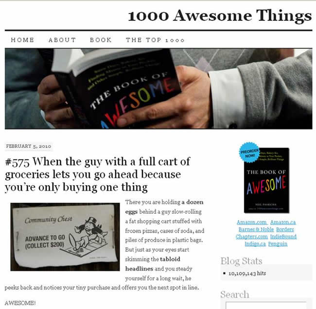
What is the blog pictured about about? Why, it's about 1000 Awesome Things, based upon The Book of Awesomeness! I don't have to read a word to know this, because the blog design – above the fold – tells me everything I need to know about this blog. If you go to the 1000 Awesome Things blog, you'll see that each blog entry contains an image. Those images, along with the title of the blog entry, can tell you if you want to read the blog entry or not. The image, in other words, works with the content. Bravo.
Note the repetition of colour and of the book (repeating that image in the viewer's eyes and subliminally in the brain) in the header and in the right column. Tricky, eh? Nice, really. And, the white background emphasizes those colours and does not detract from the importance of that book. All of this is located "above the fold."
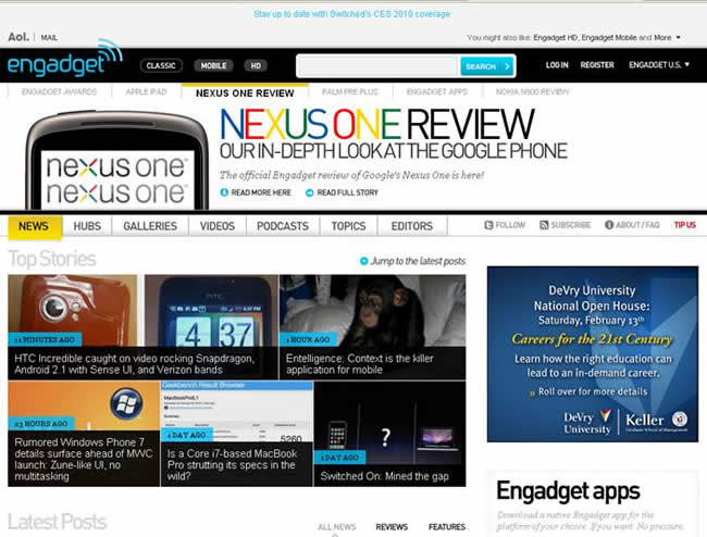
Engadget's blog doesn't look like a blog, does it? At least, it doesn't look like a blog "above the fold." If you scroll down the page on this site, you'll learn that this blog is a blog, and that the Engadget publishers use the "above the fold" space to make their blog look more like a magazine.
Note that major stories are listed at the top, under the registration information and above the menu. The menu remains important, and then the other stories and ads in the right column take third place in this hierarchy.
While it is difficult to maintain a colour theme through using photographs, you might hope that those images have something to do with the stories...so, if I'm interested in chimpanzees, I might click on that photo thinking I'll read a story about chimps. Unfortunately, I was disappointed. While Engadget enjoyed my click-through, I was not entertained by the use of an image that nothing to do with the content.
A Web site, for the most part, is for the viewers, folks...not for the writer or for the publisher(s). Even if you use your blog for self-indulgent patter, try to avoid pissing off your viewers by using images that have nothing to do with your blog entry...unless you've already developed a reputation of misleading people in the first place.
While many blogs centre on one topic or one genre of information (such as environmentalism, politics, etc.), other sites use blogs to produce news stories. Here, for example, are three such blogs: The Guardian, NPR and Huffington Post, in that order:
You cannot read the copy from this distance, as the images are so small...but, this reduction in size can help you look more closely at the images on these blogs and their placements. Which site appeals to you? Which blog would you want to read first?
My original preference was the Huffington Post – even at this reduction, you can read the headline and see who the players are in this story. The Guardian, at left, was my second choice, as the image of the woman is interesting and so is the colourful graphic above her. NPR loses out here. Although I can see that the video contains information about Sarah Palin, two things stop me from reading on (and these are personal preferences): first, Sarah Palin's voice hurts my ears, so I don't want to watch a video about her; secondly, this news at this point is old news today as I write this article.
Now, if NPR put that video above the fold, I might be tempted to click on it. But, I need to scroll down to activate the video and my motivation isn't there for this action. And, to be honest, I didn't click on the Huffington Post article, either, as I had the news on television all day and I know HP's perspective. I know what that article is about and I don't want to waste my time reading it. So, amazingly, the Guardian wins this time, as their image offered "new" news to me, and I was curious.
While your blog may not carry news, this is a lesson in repetition...if you do want to create a news blog, use images of news stories that have not already hit the mainstream media – catch someone's curiosity and you may earn some readership time on your blog.
Linda Goin
 Linda Goin carries an A.A. in graphic design, a B.F.A. in visual communications with a minor in business and marketing and an M.A. in American History with a minor in the Reformation. While the latter degree doesn't seem to fit with the first two educational experiences, Linda used her 25-year design expertise on archaeological digs and in the study of material culture. Now she uses her education and experiences in social media experiments.
Accolades for her work include fifteen first-place Colorado Press Association awards, numerous fine art and graphic design awards, and interviews about content development with The Wall St. Journal, Chicago Tribune, Psychology Today, and L.A. Times.


