Features
Enhance your website with components
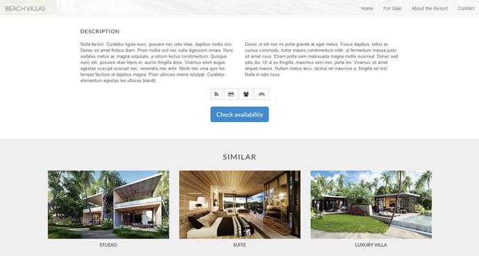
Improve the user experience on your website by adding useful components, which will help them navigate easier so that they don't get lost. This way you can provide tips and additional info, without overcrowding the page. Keep the design clean and simple for the best impact and results.

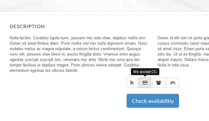
Guide your users through your content with useful tooltips. You can put bubble-like tips on any feature, button or text and show them what they need to do. Tooltips can be greatly appreciated on buttons with no text or when you need to add additional information such as links, images or simply any HTML content.

Enrich your content with Popovers
Very similar to tooltips, this great component allows you to add even much more content. The popover is an elegant and modern way to provide your users with secondary info for an element. It also gives you the opportunity to have a title and a header for your content.

Add smart Modals
Provide modal windows to improve the usability of your website. You can use numerous interface elements and structures to organize your content but with modal windows, which are basically windows that float above the page, you can never go wrong. Modal windows also allow you to save space by getting rid of large elements that don’t need to be on the main page.

Simplify your pages with well-organized content
Keep it simple is something we can hear very often when it comes to content and it's true. It's easy to achieve it if you keep away your content from over-structuring with too many images, info, buttons and so on. And this is exactly when you need to consider using components, which will "hide" most of them for the best user experience.

Add your content within Accordions
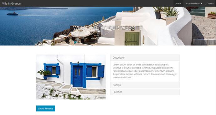
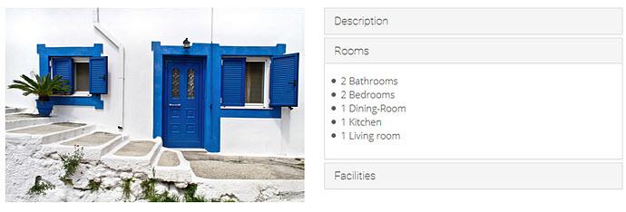
The great thing about accordions is that you give your users the opportunity to select, which part of the content to read. Separated with great headers and titles into accordion-like sections, your content is easily accessible and well-stacked.

Place your content within Tabs
Pretty similar to accordions, tabs are also an amazing way to summarize a great amount of content into meaningful sections, which occupy less screen space. Due to their shape and functionality, they add an interesting UI element which is intuitive to use and also very hard to miss by users.

With a simple click, you can offer the ultimate user-experience. Using button collapses, you can allow expanding of vast amount of content, which will never interfere with the design and simplicity of your website. It's simple, yet effective way to "hide" additional info.

 George Petrov is a renowned software writer and developer whose extensive skills brought numerous extensions, articles and knowledge to the DMXzone- the online community for professional Adobe Dreamweaver users. The most popular for its over high-quality Dreamweaver extensions and templates.