 This chapter introduces the basics of color theory, choosing color schemes that work, and good practice when dealing with color on the Web.
This sample is taken from Chapter 2: "Colors" of the Glasshaus Title "Web Graphics for Non-Designers"
This chapter introduces the basics of color theory, choosing color schemes that work, and good practice when dealing with color on the Web.
This sample is taken from Chapter 2: "Colors" of the Glasshaus Title "Web Graphics for Non-Designers"
![]()
![]()
![]()
![]()
![]()
![]()
![]()
![]()
![]()
Successful colors schemes online are chosen to support the goals of a site, be they to strengthen branding, increase sales, or maintain readership. An intelligent color scheme not only looks good, but also creates a feeling in the audience. If you choose a scheme that does not support your goals, then you have fallen short of the potential of your site.
Color can assist in achieving goals by suggesting and atmosphere that visitors can identify with. For example, a site selling baby products could use vibrant scheme that parents would appreciate as a bright and positive influence, while an art gallery could employ a black background that presented an impression of sophistication and luxury.
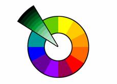
While there is more to be considered than making an attractive site, knowing how to create a harmonious color scheme is a strong start. Harmonious color schemes are derived systematically from the basic color wheel of tertiary colors. For the purposes of this grounding, they are of four types: monochromatic, analogous, complementary, and triadic. Using each, it is best to aim for a selection of three or four distinct hues, coupled with neutrals.
Monochromatic color schemes are derived from a single base color, and extended using its shades and tints (that is, a color modified by the addition of black and white). Consider, for example, a saturated green (RGB {0,255,0}). The swatches each show the pure hue in the center, with white being added to the right, and black to the left. In each case, the core hue remains identical.
| |
Monochromatic swatches: |
As you can see from the wheel above, by altering the value of this pure hue we can create colors that cleanly support the original.
| |
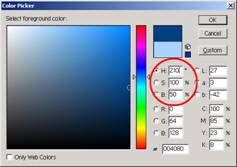
In Photoshop, changing the value next to the H in the color picker can alter hues. Adjusting the brightness is done using the value alongside the B. The S signifies the saturation of your color. The latter two values are measured as a percentage, while the hue is measured in degrees, positioning the hue on a color wheel. |
| |
Screenshot: victoriassecret.com This site bases its scheme around a feminine pink. The monochromatic scheme avoids detracting from the key, full-color photographs that sell the product. |
| |
Screenshot: evolt.org Here, the monochromatic scheme keeps the focus on the content within the site. |
A monochromatic color scheme is often considered for sites where content is of extreme importance, or when the opinions presented are of a moderate nature. It can give a site a clean and classic look, but also provides excellent opportunities to let full color photographs dominate. Monochromatic schemes are often appropriate for serious political and business sites such as those of some banks where instilling customer confidence in their experience. They are also highly suited to fashion sites where the understated monochromatic scheme supports the branding, but nevertheless allows the photographical elements to provide a focus.
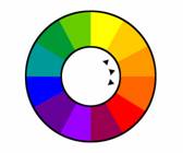
Selecting colors adjacent to one another on the color wheel creates a scheme of analogous colors. For example, orange, red-orange, and yellow-orange would be an analogous scheme with a fiery influence. The swatches below are based around an analogous set of colors with supporting tones and neutrals. Applying the first swatch, for example, could see the white being used on the darkest orange as a highlight, or used as a background color for a content region.
|
|
Analogous swatches: |
| |
Screenshot: bullseye.com.au Bullseye, providers of Internet services, use a largely orange scheme that is a direct contrast to the blue used heavily by firms providing professional services to corporate clients. |
| |
Screenshot: hillsmithestate.com Winery Hill Smith Estate has used a combination of heritage greens, accompanied by an analogous straw color that maintains the natural feel. |
An analogous color scheme can provide a truly harmonious feel to a site with a balanced visual experience. Using one of the colors predominantly will establish a solid base for your site layout, while the partnering colors maintain the soothing appearance. Examples of analogous themes are readily present in nature, from the blue-greens of the ocean to the red-browns of natural timber. Such schemes are useful in presenting resource companies as solid and hardworking, or environmental organizations as earthy and resourceful.
![]()
![]()
![]()
![]()
![]()
![]()
![]()
![]()
![]()
 George Petrov is a renowned software writer and developer whose extensive skills brought numerous extensions, articles and knowledge to the DMXzone- the online community for professional Adobe Dreamweaver users. The most popular for its over high-quality Dreamweaver extensions and templates.
George is also the founder of Wappler.io - the most Advanced Web & App Builder


Comments
Great Tutorial!
I want to add it to my favorites but I can't find a way to do it!
Thanks!
Cecilia
RE: Great Tutorial!
RE: RE: Great Tutorial!
Great Tutorial
You must me logged in to write a comment.