Win a copy of Web Standards Solutions, The Markup and Style Handbook
In conjunction with those lovely people over at friends of ED we've got five copies of their latest book – Web Standards Solutions, The Markup and Style Handbook –
to give away to registered DMXZone members.
The author Dan Cederholm runs the SimpleBits website that not only carries a thought provoking blog, but also lots of stuff on standards-compliant design. Dedicated readers of our newsletter might remember that last week we featured the SimpleBits Web Standards link list.
To be in with a chance of winning a copy all you need to do is email us with your suggestion for a DMXZone article series that you'd really like to see. The best five suggestions will earn their contributor a copy of the book …. and might see their questions answered as we turn the ideas over to our skilled panel of authors.
To whet your appetite we've even got a sample chapter from the book you can download and read.
We'll announce the winners on July 8th, so get those suggestions in quick.
True columns
We could stop right there, but as Figure 12-3 shows, we don't exactly have a two-column layout just yet. To finish the effect, we'll give the #content <div> a right margin of the same width as the right column, effectively creating a right column space for the #sidebar to fit in.
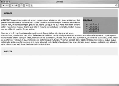
Figure 12-3. Floating the #sidebar to the right of the content
The CSS added would be as simple as
#header {
padding: 20px;
background: #ccc;
}
#sidebar {
float: right;
width: 30%;
background: #999;
}
#content {
margin-right: 34%;
}
#footer {
clear: right;
padding: 20px;
background: #eee;
}
Notice that we've given the right margin 4 percent more than the width of the #sidebar. This will give us some extra space between the two columns. Figure 12-4 shows us the results as viewed in a browser, where you can see that by adding a right margin to the content <div>, it creates the illusion of a second column.
Also of note is that we've added a clear: right; rule to the #footer declaration. This isimportant, and will ensure the footer will always appears below the sidebar and content areas—regardless of the height of either column. The footer will clear any floats that come before it.
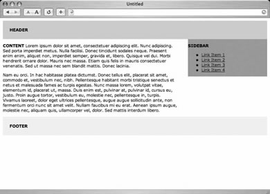
Figure 12-4. A two-column layout
We now have a working two-column layout, and can easily add more padding, backgrounds, borders, and other elements to the existing CSS declarations to make it look more appealing.
Ian Blackham
 Following a degree in Chemistry and a doctorate in Scanning Tunneling Microscopy, Ian spent several years wrestling with acronyms in industrial R&D (SEM with a side order of EDS, AFM and TEM augmented with a topping of XPS and SIMS and yet more SEM and TEM).
Feeling that he needed a career with more terminology but less high voltages, Ian became a technical/commissioning editor with Wrox Press working on books as diverse as Beg VB Application Development and Professional Java Security. After Wrox's dissolution and a few short term assignments Ian became content manager at DMXzone.
Ian is a refugee from the industrial Black Country having slipped across the border to live in Birmingham. In his spare time he helps out with the website of a local history society, tries to makes sure he does what his wife Kate says, and worries that the little 'un Noah is already more grown up than he is.