Free! CSS Sprites: Image Slicing’s Kiss of Death
In this free article Dave Shea shows how to use an innovative new CSS technique which he calls CSS Sprites that works in all modern browsers (except Opera 6), and replaces old-school image slicing and dicing (and the necessary JavaScript) with standard CSS and HTML lists.
This article was originally published by A List Apart and is reproduced by kind permission. It's copyright © 1998–2004 A List Apart Magazine, Happy Cog Studios, and Dave Shea.
CSS Sprites: Image Slicing's Kiss of Death
This article was originally published by A List Apart and is reproduced by kind permission.
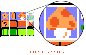
Back when video games were still fun (we're talking about the 8-bit glory days here), graphics were a much simpler matter by necessity. Bitmapped 2-dimensional character data and background scenery was individually drawn, much like today's resurgent pixel art. Hundreds and later thousands of small graphics called sprites were the building blocks for all things visual in a game

As game complexity increased, techniques developed to manage the multitude of sprites while keeping game play flowing. One variation saw sprites being plugged into a master grid, then later pulled out as needed by code that mapped positions of each individual graphic, and selectively painted them on the screen.
And what does this have to do with the web?
Everything old is new again, and though the rise of 3D games has made sprite maps obsolete, the concurrent rise of mobile devices with 2D gaming capabilities have brought them back into vogue. And now, with a bit of math and a lot of CSS, we're going to take the basic concept and apply it to the world of web design.
Specifically, we're going to replace old-school image slicing and dicing (and the necessary JavaScript) with a CSS solution. And because of the way CSS works, we're going to take it further: by building a grid of images and devising a way to get each individual cell out of the grid, we can store all buttons/navigation items/whatever we wish in a single master image file, along with the associated "before" and "after" link states.
How do CSS Sprites work?
As it turns out, the basic tools to do this are built into CSS, given a bit of creative thinking.
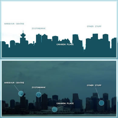
Let's start with the master image itself. Dividing a rectangle into four items, you'll observe in this master image (below) that our intended "before" link images are on the top row, with "after" :hover states immediately below.

There's no clear division between the four links at the moment, so imagine
that each piece of text is a link for now. (For the sake of simplicity, we'll
continue to refer to link images as "before" images and the :hover
state as "after" for the rest of this article. It's possible to
extend this method to :active, :focus, and :visited
links states as well, but we won't go into that here.)
Those familiar with Petr Stanicek's (Pixy) Fast Rollovers may already see where we're going with this. This article owes a debt of gratitude to Pixy's example for the basic function we'll be relying on. But let's not get ahead of ourselves.
On to the HTML. Every good CSS trick strives to add a layer of visuals on top of a clean block of code, and this technique is no exception:
<ul id="skyline">
<li id="panel1b"><a href="#1"></a></li>
<li id="panel2b"><a href="#2"></a></li>
<li id="panel3b"><a href="#3"></a></li>
<li id="panel4b"><a href="#4"></a></li>
</ul>
This code will serve as a base for our example. Light-weight, simple markup that degrades well in older and CSS-disabled browsers is all the rage, and it's a trend that's good for the industry. It's a great ideal to shoot for. (We'll ignore any text inside the links for the time being. Apply your favorite image replacement technique later to hide the text you'll end up adding.)
Bruce Lawson
 I'm the brand manager of glasshaus, a publishing company specialising in books for web professionals. We've a series for dreamweaver professionals - the dreamweaver pro series.