Be the first to write a review
Free! CSS Drop Shadows
In this free article, Sergio Villarreal shows how to use CSS to make drop shadows, in a way that works across all modern browswers and conforms to Web Standards.
This article was originally published by A List Apart and is reproduced by kind permission. It's copyright © 1998–2004 A List Apart Magazine, Happy Cog Studios, and Sergio Villarreal.
CSS Drop Shadows
They're the corkscrew in every graphic designer's Swiss Army knife. Much used, oft maligned but always popular, drop shadows are a staple of graphic design. Although easy to accomplish with image-editing software, they're not of much use in the fast-changing world of web design. On the web, adaptability and ease of use dictate trends — and static images with a fixed background effect are not very adaptable.
But what if we had a technique to build flexible CSS drop shadows that can be applied to arbitrary block elements? That can expand as the content of the block changes shape? Compatible with most modern browsers? With better results for standards-compliant browsers? If you're not sold yet, we can also tell you that it requires minimal markup.
Interested? Well, first off, we wouldn't want to take credit for something we didn't invent, but merely improved upon. This particular technique was conceived and demonstrated by Dunstan Orchard, of 1976 design fame (hats off to you, Dunstan). We found it was easy, intuitive, and worked like a charm. However, after closer examination, we saw room for improvement and set to work on it.
Here's how it works: you need to make a drop shadow image in the image editor of your choice. It should be only the shadow, without a visible border (an easy way to do this is by applying the effect to an empty selection). Make sure your image is big enough to cover the maximum expected size of the block elements that will use it. In practice, we've found that 800 x 800 is a respectable enough size. Save it as a GIF, making sure you use the color of the background you'll apply the effect over. Additionally, save the same shadow with full alpha transparency (no background color) as PNG. This will be used to feed a better shadow to browsers capable of displaying it. These are some sample files: GIF file/PNG file.

We'll start by giving a shadow to an image and then move on to other block elements. In a moment of ingenuity, we decided to name our class "img-shadow". Our test subject shall be this cute cat:
And its corresponding markup (one div is the only extra markup we'll need):
<div class="img-shadow">
<img src="cat.jpg" alt="test"/>
</div>
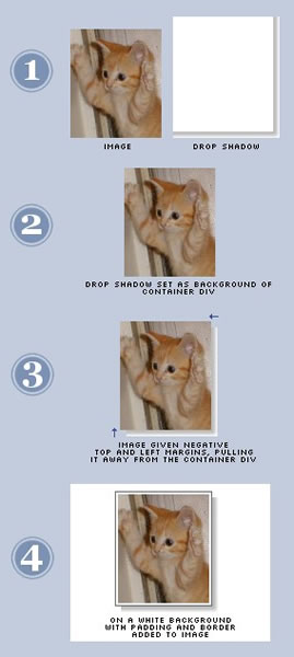
The following illustration shows how the technique works:

First, our previously prepared shadow file will be set as background for the div.
background: url(shadow.gif) no-repeat
bottom right;
Then we'll give the image negative top and left margins to make the "drop" that gives us the shadow. Our shadow is six pixels wide, so that's our magic value.
margin: -6px 6px 6px -6px;
We float the div to avoid having to specify its size (otherwise it will take up all available horizontal space).
Remember we said that we'd provide better shadows for better browsers? This line will do the trick:
background: url(shadowAlpha.png) no-repeat
right bottom !important;
That "!important" bit tells the browser that the declaration is to take precedence over normal declarations for the same element (see the spec). It also happens to be unsupported in all versions of Internet Explorer, which also lack native support for transparent PNGs. It's almost too convenient. By specifying controversial declarations twice, we get the desired behavior (IE takes the second one, most other browsers the first one). The end result is that, were the background color to change, browsers that support PNG would maintain a perfectly transparent shadow. Sadly, Explorer's shadow will stay with its original background color.
But why do this you ask? The reasons are twofold:
- We can: This is a painless, effortless and automatic hack that yields great results in the browsers that support it.
- It may fix itself: If the new version of Internet Explorer (shipping with Longhorn) supports both of these standards, we won't have to fix a thing to get pixel-perfect, truly transparent shadows in it.
The finished CSS code looks like this:
.img-shadow {
float:left;
background: url(shadowAlpha.png) no-repeat bottom right !important;
background: url(shadow.gif) no-repeat bottom right;
margin: 10px 0 0 10px !important;
margin: 10px 0 0 5px;
}
.img-shadow img {
display: block;
position: relative;
background-color: #fff;
border: 1px solid #a9a9a9;
margin: -6px 6px 6px -6px;
padding: 4px;
}
Differences in margin size account for IE's box model, and that last padding value gives us a nice frame around the image. Sadly, it is lost in IE 5.5 and 5.0. The drop shadow effect stays, though.
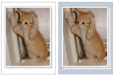
Our shadow will blend seamlessly with its background in standards-compliant browsers. In Explorer, the shadow will clash with the background unless you've stuck with the background color you used for your shadow. You can see the results here:

For the next part, we'll apply the drop shadow effect to a paragraph.
Logic dictates that the same technique should yield similar results when working with a paragraph, which can be treated as another block element. And indeed, with most browsers, it works like a charm. Care to guess which one doesn't get it right?
While developing this technique, we found that when working with a block element other than an image, in bold defiance of common sense, Explorer decided to clip the left and top parts of the block — the ones that "jump" out of the shadow — regardless of what we tried. Amusingly enough, the only version of Explorer that gets this right is 5.0. No amount of hacks, overflow settings, or gentle suggestions seemed to help (and yes, righteous cursing was tried). We gave up and decided that a different approach was called for.
The method we came up with is partly based on Douglas Bowman's Sliding Doors methodology, and calls for an extra bit of markup (another div), so our paragraph will look like this:
<div class="p-shadow">
<div>
<p>The rain in Spain
...</p>
</div>
</div>
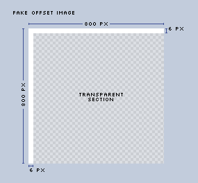
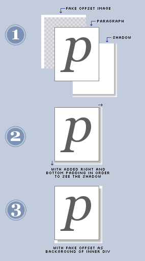
Instead of giving the paragraph negative top and left margins, we'll give it positive right and bottom padding. This will expose the shadow (set as background for the outermost div). Then we'll fake the shadow offset by using a partly transparent GIF as background for the inner div, which will overlap the shadow. Make sure that the visible part of this image is the same color as the background over which you use the drop shadow effect. Name the image "shadow2.gif". It should be constructed as follows:

Here's an example GIF file (this image will most likely look as white on white on your browser, so you may want to save it and take a look at it in your image editing program).
This illustration shows what we're going to do:

The following are the styles needed to accomplish the effect. Notice that the extraneous image and padding are used only by Internet Explorer. Most other browsers effectively ignore the inner div, and stick with the method we used for the drop shadow of the image.
.p-shadow {
width: 90%;
float:left;
background: url(shadowAlpha.png) no-repeat bottom right !important;
background: url(shadow.gif) no-repeat bottom right;
margin: 10px 0 0 10px !important;
margin: 10px 0 0 5px;
}
.p-shadow div {
background: none !important;
background: url(shadow2.gif) no-repeat left top;
padding: 0 !important;
padding: 0 6px 6px 0;
}
.p-shadow p {
color: #777;
background-color: #fff;
font: italic 1em georgia, serif;
border: 1px solid #a9a9a9;
padding: 4px;
margin: -6px 6px 6px -6px !important;
margin: 0;
}
The same considerations for background color mentioned in the image example apply for paragraphs. Here's the end result. (When live, try resizing the text on your browser to see the box change size and watch the shadow adjust.)
The rain in Spain falls mainly on the plain.
 I'm the brand manager of glasshaus, a publishing company specialising in books for web professionals. We've a series for dreamweaver professionals - the dreamweaver pro series.