FREE! Applying CSS to Forms Support

Forms are an essential part of interaction on the Internet but they can look rather drab. In this FREE article, suitable for beginners, Trenton Moss from the UK based webcredible consultancy takes us quickly through a method of making our forms a bit brighter nicer and user friendly.
Trenton Moss is the driving force behind webcredible; he knows an awful lot about accessibility and the Disability Discrimination Act.
If you want to delve deeper into using CSS to style forms check out these other DMXzone articles:
JavaScript Tricks for Usable Forms
![]()
![]()
![]()
Applying CSS to Forms
Forms are an essential part of interaction on the Internet but they can look rather drab. With CSS we can position form items so they all line up nicely and add a bit of colour to jazz them up.
The original form
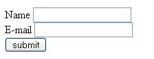
That form looks horrible! Here's the code behind it:
<form action="destination.htm">
<label for="name">Name</label> <input type="text" id="name" /><br />
<label for="e-mail">E-mail</label> <input type="text" id="e-mail" /><br />
<input type="submit" value="submit" />
</form>
Positioning the form with CSS
The first thing we need to do to the form is make it line up nicely. In the old days this could only be achieved with tables - not anymore, courtesy of our old friend, CSS. First, we'll assign a class to each form item:
<form action="destination.htm">
<label for="name">Name</label> <input type="text" id="name" class="input-box" /><br />
<label for="e-mail">E-mail</label> <input type="text" id="e-mail" class="input-box" /><br />
<input type="submit" value="submit" class="submit-button" />
</form>
The two input boxes have been assigned the class, input-box, and the submit button, submit-button - hmm... how did we think up those names?
Now they've got their classes we'll need to assign some rules to them:
label
{
width: 4em;
float: left;
text-align: right;
margin: 0 1em 10px 0
clear: both
}
.input-box
{
margin-bottom: 10px }

      .submit-button
{
margin-left: 5em;
clear: both
}
Right, let's go through that CSS bit-by-bit. We gave the label a fixed width of 4em, although this should obviously be increased if the prompt text in the form is anything longer than what we've got now (name and e-mail). We also specified the width in terms of em and not px so that if users increase the text size the width will increase with the larger letters.
The margin: 0 1em 10px 0 CSS command means the labels will have a margin above them of 0, to the right of 1em (so that the text isn't up against the input box), a bottom margin of 10px (to create some space between each line) and a left margin of zero. The clear:both CSS command is necessary to ensure the text (name and e-mail) starts on a new line.
The submit button has a left margin of 5em so that it aligns with the input boxes, which are 5em from the left. This includes the 4em width and the 1em right margin of the prompt text.
So, putting that altogether gives us this form:
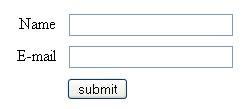
Looks much better, but it's still rather plain. Let's use some more CSS to jazz up the form so it's more inline with the colour scheme on the page.
![]()
![]()
![]()