In this article we'll go through all the 37 elements that are included in DMXzone Bootstrap 3 Elements extension and how to use them. You can simply follow the video tutorials and learn how to access each element in Dreamweaver as well as customize it. If you have any other questions, please use the extension support forums or contact us via Live Support. Note that DMXzone Bootstrap 3 Elements works only with DMXzone Bootstrap 3 extension.
DMXzone Bootstrap 3 Elements Manual
Learn how to use the DMXzone Bootstrap 3 Elements extension


Reference: List of Bootstrap 3 Elements and their Properties
Explore the list of all 37 DMXzone Bootstrap 3 elements, what they can achieve in your design and their properties for customization.
Typography
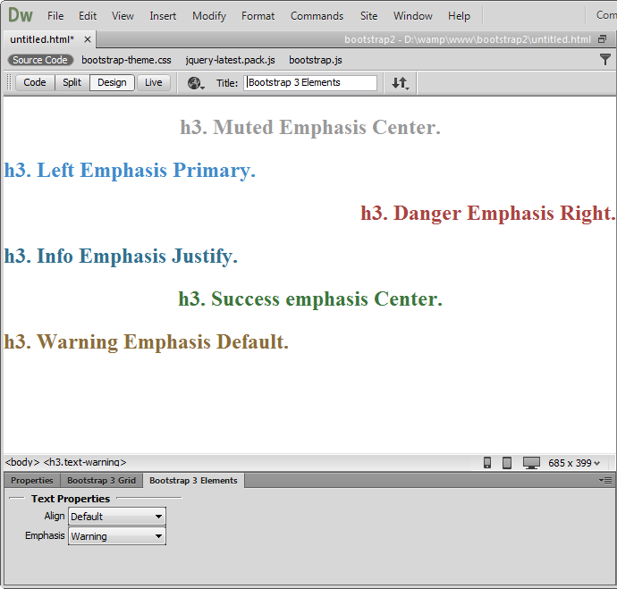
 Title
Title
The default title element is H3. You can change it with another heading between
H1 and H6. From the element properties you can change the alignment
to be default, left, center, right and justify. Also you can choose from six
default lightweight styles (emphasis).
 Paragraph
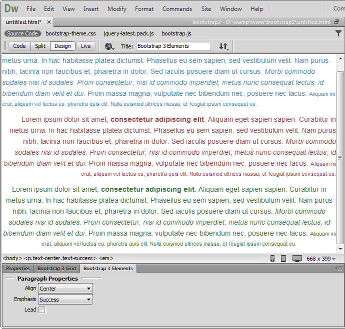
Paragraphs are by default 14px font size with a line height of 1.428. In
addition, paragraphs receive a bottom margin of half their line-height (1-px by
default).
 Address
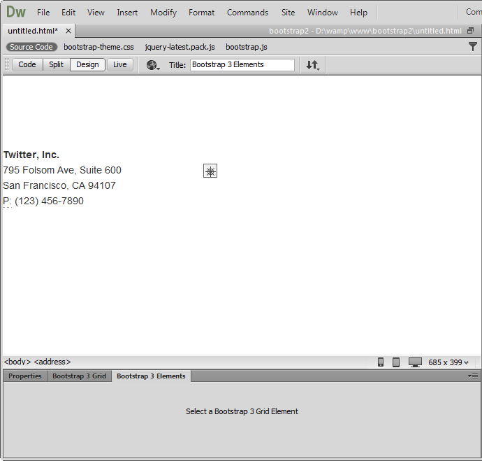
Add contact information such as address, name, phone number, etc.
 Blockquote
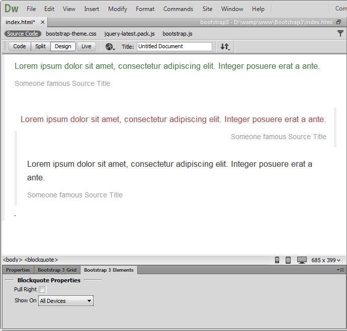
You can quote any block of content from another source within your page.
Blockquote can be aligned to the left or pulled to the right.
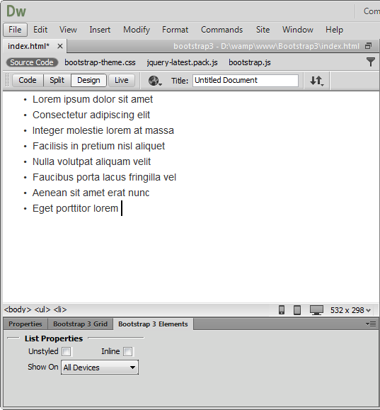
 Unordered
List
Unordered
List
Add a list of items with bullets, where the order doesn't matter. From the
element properties you can remove the default styling and also show all list
items inline.
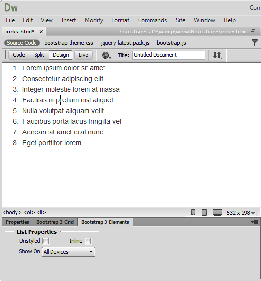
 Ordered
List
Ordered
List
Add a list of items with numbering, where the order does matter. From the
element properties you can remove the default styling and also show all list
items inline.
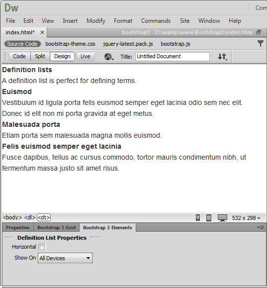
 Definition
List
Definition
List
Add a list of terms, features or anything that needs a definition or
explanation. From the element properties you can make the list also horizontal.
Tables
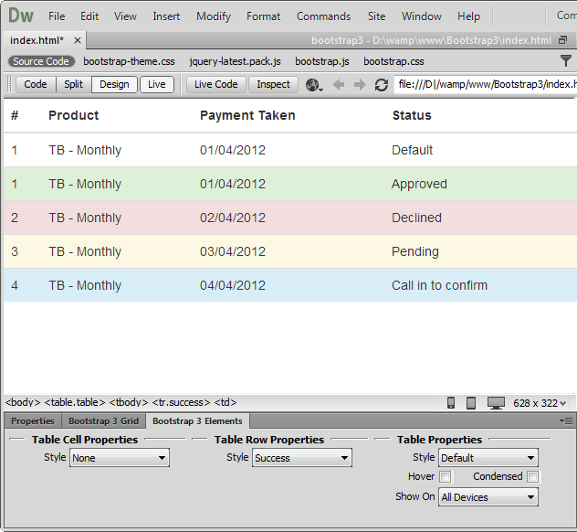
 Table
Table
Add a table with as many rows and columns as you wish. From the element
properties you can choose the table row style and also style the table with
borders and rounded corners. You can enable the rows hover state and make it
more compact by cutting cell padding in half by checking the condensed mode.
Now your table can be also responsive.
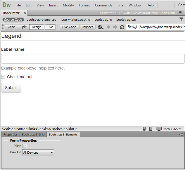
Forms
 Form
Form
Add a form where your users enter data for processing. From the element
properties, the form can also be inline.
 Search Form
Add a search field to your forms, where your users will type in keywords to
search through the content.
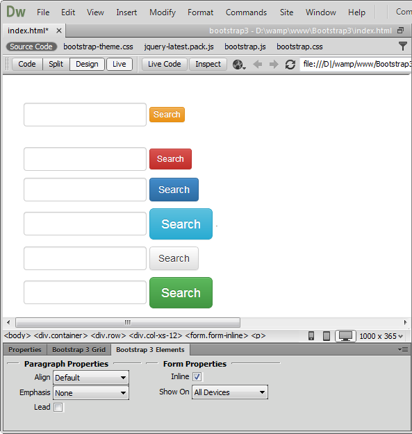
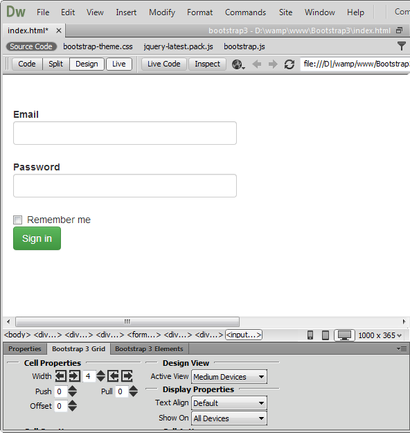
 Horizontal
Form
Horizontal
Form
In
the horizontal form, the labels and input fields are on the same line.
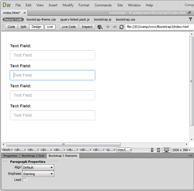
 Control
Group
Control
Group
Add a simple input field with a label.
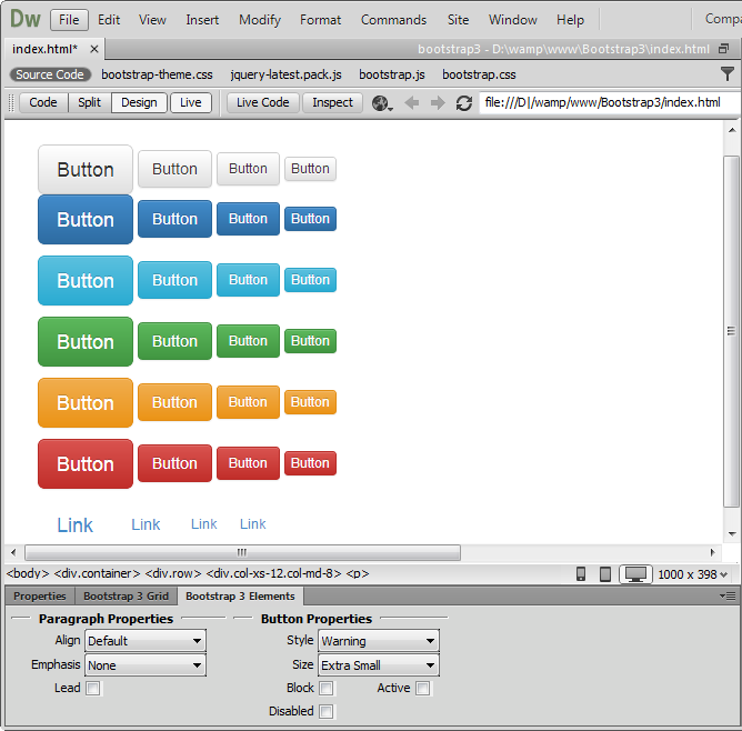
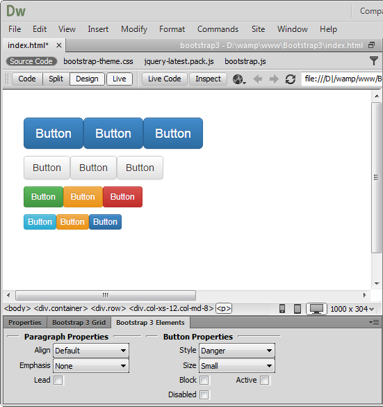
Buttons
 Button
You can add buttons with different sizes (large, default, small and extra
small) and choose one of the predefined lightweight designs. From the element
properties you can make a button non-clickable by disabling it or make it fit
the cell entirely by width.
 Anchor
Button
Anchor
Button
If you need to use a text link that looks like a button, anchor button element
is the right one to choose.
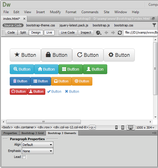
 Button with
icon
Button with
icon
There are 200 icons supplied in the extension that you can use on any button
size or design.
 Button group
You can add as many buttons next to each other as you need. They can be with or
without styling and icons. The alignment can be horizontal as well as vertical.
Images
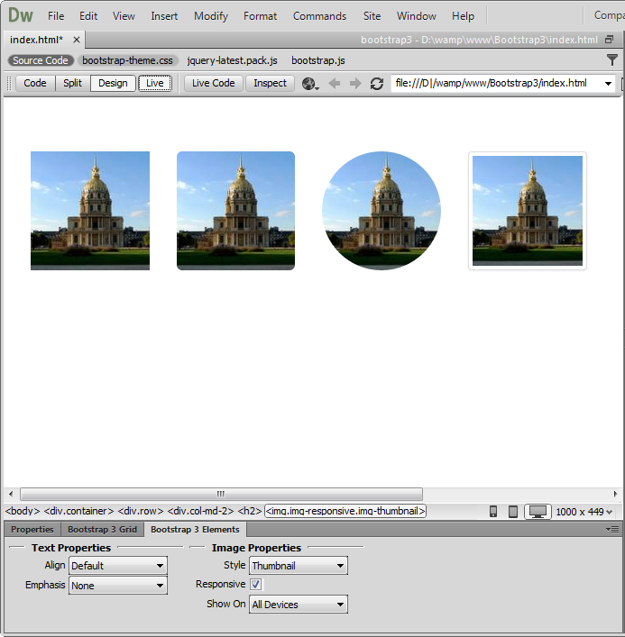
 Image
Image
There are 4 styles you can add to the images - default, rounded corners, circle
and thumbnail. Also you can set the images to be fully responsive.
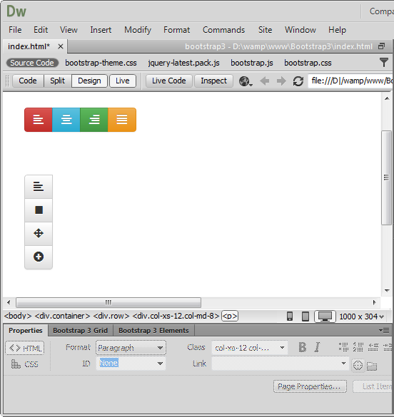
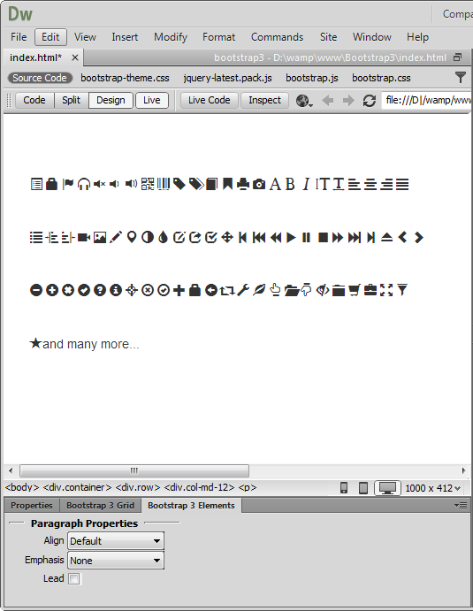
Icons
 Icons
Icons
200 icons in sprite form to be used in buttons, button groups for a toolbar, or
prepended form inputs.
Pagination
 Pagination
Add a simple pagination, great for apps and search results. From the element
properties you can choose the position and the size of the paginator.
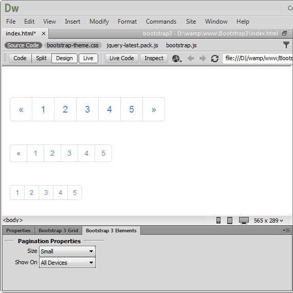
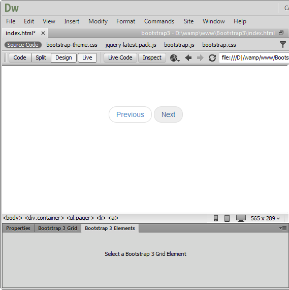
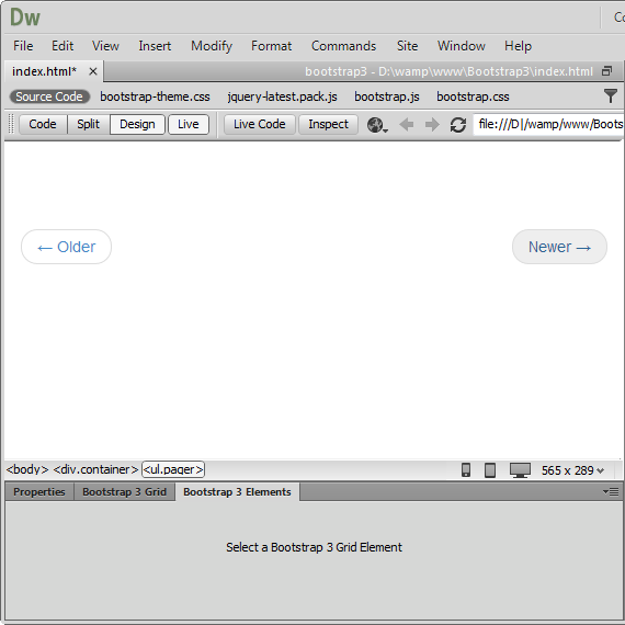
 Pager
Pager
Quick previous and next links for simple pagination, implementations with light
markup and styles. It's great for simple sites like blogs or magazines.
 Aligned
pager
Aligned
pager
Quick links for simple pagination aligned to each side.
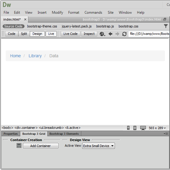
 Breadcrumb
Add easy navigation that allows users to keep track of their locations within
programs or documents.
Labels and Badges
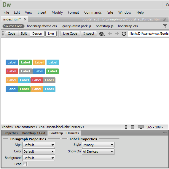
 Labels
Create eye catching labels and annotate text with inline labels. From the
element properties you can style the labels with lightweight designs.

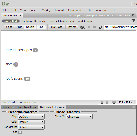
Badges
Add small and simple badges for displaying an indicator or count. They're
commonly found in email clients or on mobile apps for push notification.
Layouts
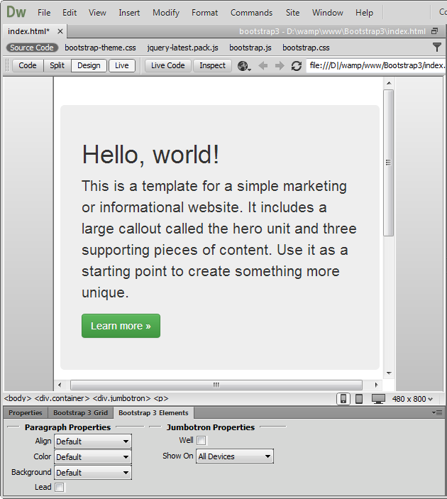
 Jumbotron
Add a lightweight, flexible component to showcase key content on your site. It
works well on marketing and content-heavy sites. From the element properties
you can add a simple effect to give it an inset effect with padding and rounded
corners.
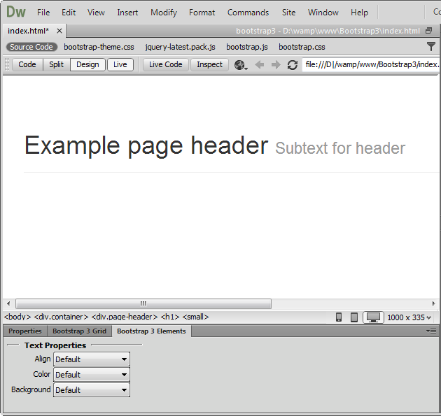
 Page
header
Page
header
Add text that is separated from the main body of text and appears at the top.
From the elements properties it can be aligned center, left and right.
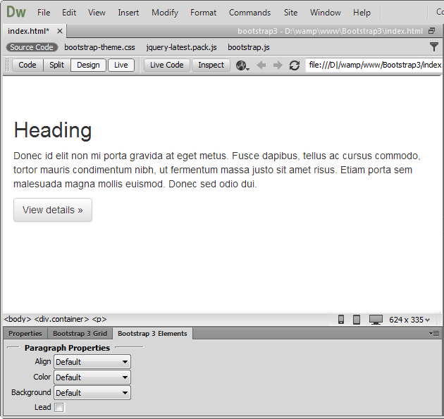
 Text
Text
Use this element to add content on your page with a header, paragraph and
button.
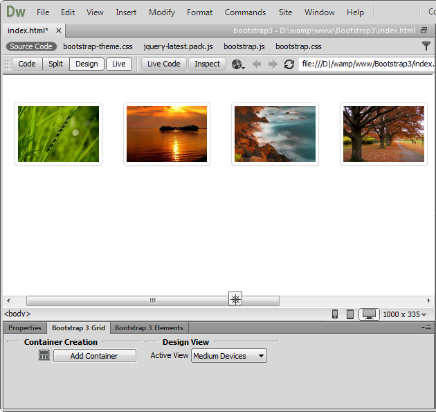
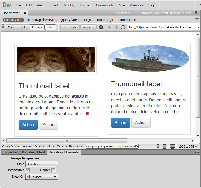
Thumbnails
 Thumbnails
Add grids of photos, videos, products or anything that needs thumbnail display.
 Advanced
thumbnails
Advanced
thumbnails
Add any kind of HTML content like headings, paragraphs, or buttons into
thumbnails.
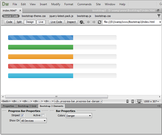
Progress bars
 Progress bar
Visualize the progression of an action with a progress bar. From the element
properties you can customize the color and add striped effect. Also you can
animate the stripes during process. Note that the animation is not supported in
IE9 and below versions as well as in older versions of Firefox. Opera 12 does
not support animations.
 Stacked
progress bar
Stacked
progress bar
Put multiple bars into the same progress bar to stack them. From the element
properties you can use the same lightweight styles like the ones for buttons.
Also they can be striped and animated.
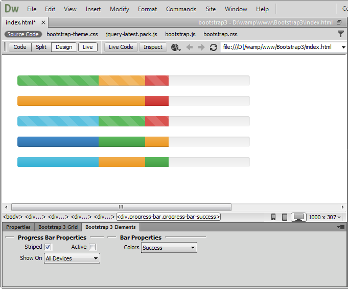
Note: Progress bars use CSS3 transitions and animations to achieve some of their effects. These features are not supported in Internet Explorer 9 and below or older versions of Firefox. Opera 12 does not support animations.
Alerts
 Alert
Alert
Add a simple text for a basic warning alert message with a close
button that can be styled.
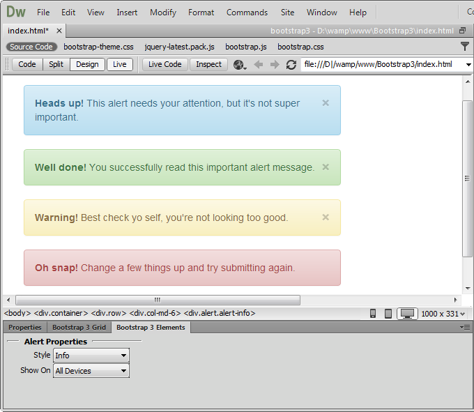
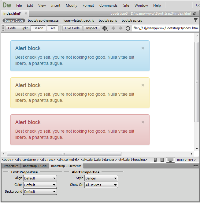
 Alert Block
Add a longer warning alert message with description and close button.
Media
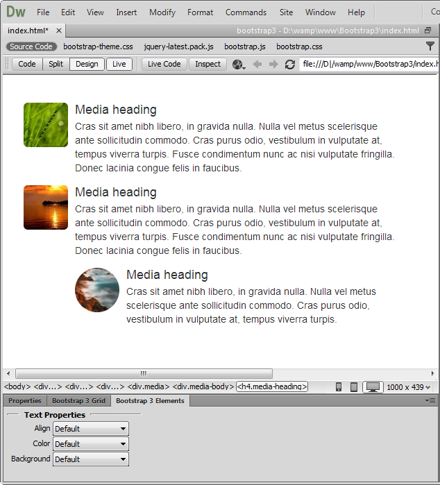
 Media object
Float
a media object (images, video, audio) to the left or right of a content block.

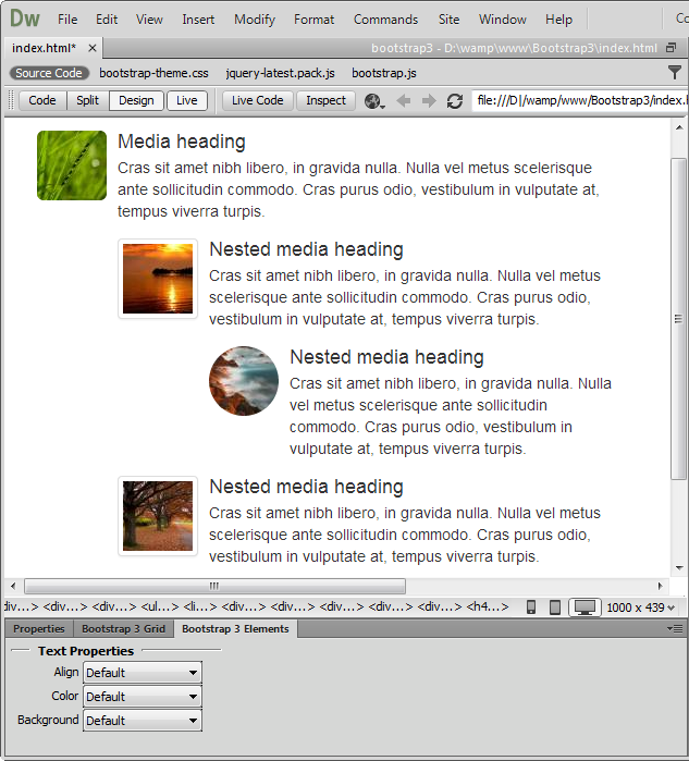
Media list
You can use media inside list, which is useful for comment threads or articles
lists.
List Group
 List
Group
List
Group
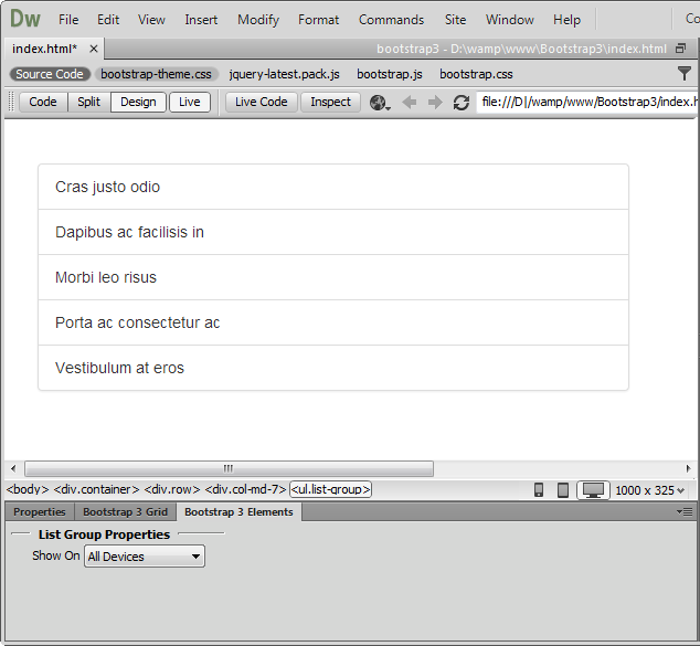
List
groups are a flexible and powerful component for displaying not only simple
lists of elements, but complex ones with custom content. You can also add
badges to any list group item and it will automatically be positioned on the
right.
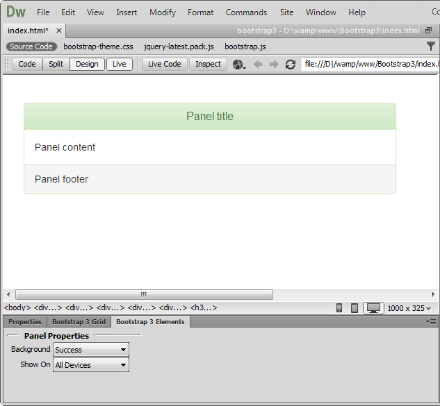
Panels
 Panels
You can put your content within panels to save space on your layout. Easily,
you can add headings and make a panel more meaningful to a particular context
by adding a background color.
Lubov Cholakova
 Lubov has been with DMXzone for 8 years now, contributing to the Content and Sales departments. She is bringing high quality content in the form of daily blog updates, reviews, tutorials, news, newsletters,update emails and extensions' manuals. If you have a product that needs publicity or any other questions about the entire DMXzone community, she is the one you can contact.
Comments
Be the first to write a comment
You must me logged in to write a comment.