 This chapter introduces the basics of color theory, choosing color schemes that work, and good practice when dealing with color on the Web.
This sample is taken from Chapter 2: "Colors" of the Glasshaus Title "Web Graphics for Non-Designers"
This chapter introduces the basics of color theory, choosing color schemes that work, and good practice when dealing with color on the Web.
This sample is taken from Chapter 2: "Colors" of the Glasshaus Title "Web Graphics for Non-Designers"
![]()
![]()
![]()
![]()
![]()
![]()
![]()
![]()
![]()
Unfortunately, it is not uncommon to encounter genuine lost artwork or client apathy and be forced to work from nothing but a printed logo (such as a letterhead). If faced with this scenario, you should aim for a "best guess" by comparing your printed source and an on-screen color picker until satisfied with your selection. This, however, is an absolutely final alternative. Do not forget to consider calibrating your monitor to use a gamma correction similar to that likely to be used by a majority of your eventual audience. Gamma correction is discussed briefly at a later stage of this chapter.
Given an undefined corporate color or set of colors, adapting a scheme from a logo is a sensible second priority and can be built upon using the methods outlined previously. When caught with a disassociated scheme within a brand, perhaps selected by misguided designers, all hope is not lost. A resourceful developer will choose and emphasize one hue. Techniques to prevent the inharmonious colors remaining in your logo from affecting your scheme are discussed later in this chapter. After selecting one hue and treating it as a base element, choosing either a complementary or analogous support cast is straightforward.
![]()
Drawing a color scheme from prominent hues in a featured image can be a successful backup option in a number of cases. Two such situations are:
Weak or no brand: Of the many commercial sites on the web, a great number do not possess a recognizable brand, or perceive little need for an investment in an image of this sort. Examples of sites falling into this category are small clients such as automotive businesses, tradespeople, artists (whether visual or audio), and freelance programmers. Rather than being a condition to be ashamed of, it is nothing less than a blank canvas and an exciting opportunity. Basing your color scheme on a catchy or otherwise key image gives you instant direction.
Strong promotion: Instances of important promotions, or cases where the "concept" of the site far outweighs the brand recognition, are other opportunities to use a feature image as a base for your theme. Examples of sites for which this could be appropriate include travel agencies, auction sites, and interior decorators.
Selecting colors from a feature image is as simple as color picking for inspiration by choosing one of the more dominant colors, and then seeking an analogous or complementary union.
The eyedropper tool available in most graphics packages provides a choice of a point sample (single pixel), or a color average over a 3x3 or 5x5 pixel sample. These latter options prove quite useful if you are attempting selection of a green from a shrub, blue from the sky, or brown from a timber texture.
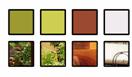
A swatch showing the regions in which the eyedropper tool was used to source inspiration accompanies the screenshot below. In this case, the interior design company Key Designs & Developments possessed corporate stationery using various strengths of silver and transparent plastic stock. Translating this to the web was a difficult task, and so an olive color and lighter tint were color-picked from the courtyard greenery. Then a complementary red-brown was selected from the feature candles in the other highlighted photograph.
| |
Screenshot: keydd.com.au |
An alternative to the feature image source of color schemes is the world around you. Thousands of opportunities exist throughout nature, industrial design, lighting effects, and the fashion world that can inspire you to choose a scheme and even supporting photographical elements. With a blank canvas and a target feeling for your audience, finding motivation is painless.
Much of this is easier to learn through practice rather than pure instruction. Use your knowledge of color theory to choose and create your schemes. Consider the following photographs and the swatches they inspired.
| |
|
|
![]()
![]()
![]()
![]()
![]()
![]()
![]()
![]()
![]()
 George Petrov is a renowned software writer and developer whose extensive skills brought numerous extensions, articles and knowledge to the DMXzone- the online community for professional Adobe Dreamweaver users. The most popular for its over high-quality Dreamweaver extensions and templates.
George is also the founder of Wappler.io - the most Advanced Web & App Builder


Comments
Great Tutorial!
I want to add it to my favorites but I can't find a way to do it!
Thanks!
Cecilia
RE: Great Tutorial!
RE: RE: Great Tutorial!
Great Tutorial
You must me logged in to write a comment.