 This chapter introduces the basics of color theory, choosing color schemes that work, and good practice when dealing with color on the Web.
This sample is taken from Chapter 2: "Colors" of the Glasshaus Title "Web Graphics for Non-Designers"
This chapter introduces the basics of color theory, choosing color schemes that work, and good practice when dealing with color on the Web.
This sample is taken from Chapter 2: "Colors" of the Glasshaus Title "Web Graphics for Non-Designers"
![]()
![]()
![]()
![]()
![]()
![]()
![]()
![]()
![]()
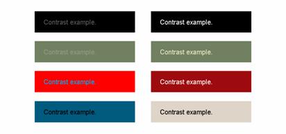
Black text on a white background, the default color scheme of the Web, is high contrast and very readable, ensuring less frustration for visitors with poor eyesight. Maintaining these typical settings across the Web, however, would lead to a particularly bland experience. Additionally, such strong contrast can affect people with overly light-sensitive eyes. A dark text color with an off-white background color can often be more appropriate.
Adequate contrast between your visual elements (text, buttons, images) and their background environments can be achieved with a color scheme that meets the visual goals of your site, whether that is to be exciting and bold, muted and serious, or modern and unique.
Below are a number of examples of text and background color combinations showing poor contrast (left), and sufficient contrast (right). Remember that reading on the Web can be difficult even with a sensibly contrasting set of colors, so please avoid making it any more difficult.
How colors behave when near each other is an important consideration for any developer. Adjacent complementary or discordant colors can wreak havoc on the eyes of your users, and because of this, care and restraint should be exercised when using such schemes.
If your design does call for text in one color on a background of its complement, then ensure that the contrast between the two is substantial enough to ease legibility. Reading should not be a battle for your audience!
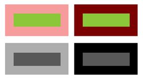
A light block of color near a dark area will appear lighter than it actually is, and the dark one darker. This is a key example of the visual effects colors have on each other through association. In the image below, the two green blocks are the same size and color. This is also true of the charcoal blocks, and in this case it is especially obvious that when surrounded by black, the charcoal block appears lighter than its counterpart on the silver background.
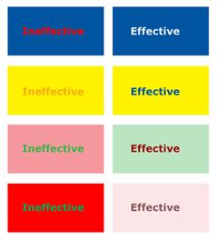
The American Foundation for the Blind estimates the number of people who are blind and visually impaired in the United States as 10 million. With similarly significant numbers in Europe, Oceania, and elsewhere, it is important that your color-based decisions do not negatively impact these people.
Color deficiencies commonly associated with partial sight, for example, can make differentiation of hues between colors difficult. It can also impact the ability to discriminate colors with minimal variation in saturation.
Your designs can account for the visually impaired by ensuring that your color choices regarding critical elements (text, buttons, links, and alerts for example) differ significantly with respect to hue, lightness, and saturation.
Examples of poor (left) and sensible (right) combinations are shown below. The more effective examples provide better differentiation between hue and values of lightness and saturation.
![]()
![]()
![]()
![]()
![]()
![]()
![]()
![]()
![]()
 George Petrov is a renowned software writer and developer whose extensive skills brought numerous extensions, articles and knowledge to the DMXzone- the online community for professional Adobe Dreamweaver users. The most popular for its over high-quality Dreamweaver extensions and templates.
George is also the founder of Wappler.io - the most Advanced Web & App Builder
Comments
Great Tutorial!
I want to add it to my favorites but I can't find a way to do it!
Thanks!
Cecilia
RE: Great Tutorial!
RE: RE: Great Tutorial!
Great Tutorial
You must me logged in to write a comment.