In this article we'll take a more in depth look into the features and options, packed in DMXzone Bootstrap 3 extension. Working with the dedicated floating panel is super easy and all options are accessible on mouse click. Add/delete cells, rows, merge, align, it's all there to create a fully responsive layout for your website or app.
DMXzone Bootstrap 3 Manual
May 17, 2016
DMXzone Bootstrap 3 Reference
Features
General Features
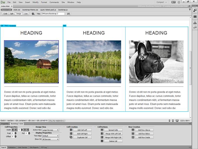
Bootstrap 3 grid dedicated floater
With the greatly helpful and easy accessible floating panel you have all the needed options just a mouse click away.
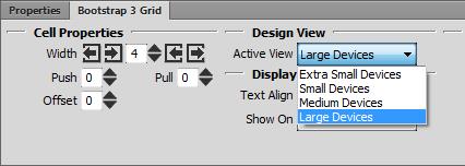
Design for each device differently, directly in Dreamweaver
There are four Grid systems included in Bootstrap 3 for extra small devices, such as phones < 768px, small devices (tablets>= 768px), medium devices (desktops>= 992px) and large devices (desktops>= 1200px).
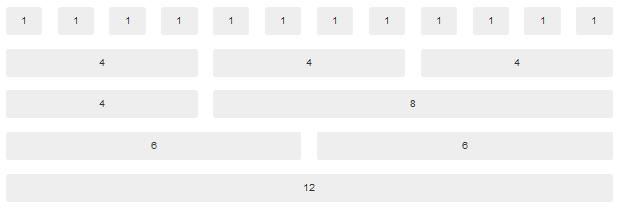
Twitter Bootstrap 12-column responsive grid
It includes a responsive, mobile first fluid grid system that appropriately scales up to 12 columns as the device or viewport size increases.
Support for advanced grid layouts and nested columns
You can add as many rows as you wish within a column and it's incredibly easy and much more intuitive!
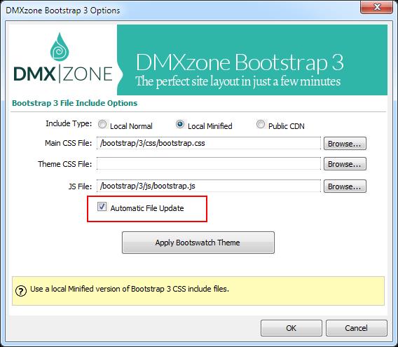
Automatic file copy and include
If you don't like to automatically copy bootstrap files and inclusion, you can switch it off!

