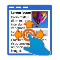
This week we have a new and improved version of the Sliding Panels extension. Now you can create fully responsive panels on mobile devices and when the navigation bar
does not fit, it can be scrolled with gestures. To check this great new feature, you can view the showcase we built for you below. This new version also comes with improved form handling, better CS6 compatibility and more.
Until next Wednesday you can get the Sliding Panels with 50% off and save money so hurry up!
The Story
Responsive Sliding Panels Bikes Showcase
For this showcase we created a responsive bikes catalog with the Sliding Panels extension, which is greatly displayed on any mobile device as
well as on a desktop browser. On smart phones and tablets, when the navigation bar
does not fit, it can be scrolled with gestures!

What's new in Sliding Panels 1.0.8:
- Now the iPhone and iPad designs are fully responsive! When the navigation bar does not fit, it can be scrolled with gestures! Also on arrow navigation the current selection is updated and the navigation bar automatically scrolls if needed.
- Improved Form handling in Sliding Panels
- Improved Dreamweaver CS6 compatibility
- Improved installer for Dreamweaver CS 6.1 (Adobe Creative Cloud) compatibility
 Lubov has been with DMXzone for 8 years now, contributing to the Content and Sales departments. She is bringing high quality content in the form of daily blog updates, reviews, tutorials, news, newsletters,update emails and extensions' manuals. If you have a product that needs publicity or any other questions about the entire DMXzone community, she is the one you can contact.
See All Postings From Lubov Cholakova >>
Comments
Be the first to write a comment
You must me logged in to write a comment.