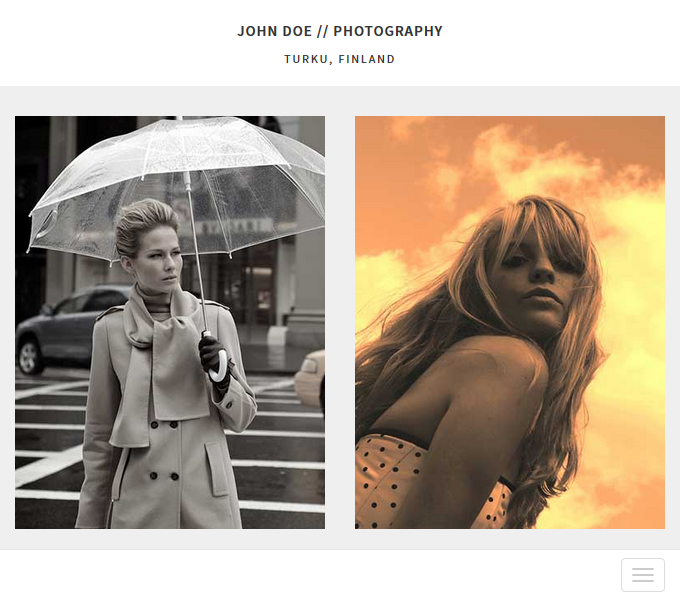
Last week we spoke about the advantages of the mobile-first design approach that Twitter implemented in Bootstrap 3. We also showed you a couple of page layouts that featured that very same approach but completely executed with DMXzone Bootstrap 3, and today we have another one. The minimalistic design focuses on the images, which look great on any device screen, even on small phones so check it out below.
If you still don't have DMXzone Bootstrap 3 make sure to get it quick as the sale ends tomorrow!

 Lubov has been with DMXzone for 8 years now, contributing to the Content and Sales departments. She is bringing high quality content in the form of daily blog updates, reviews, tutorials, news, newsletters,update emails and extensions' manuals. If you have a product that needs publicity or any other questions about the entire DMXzone community, she is the one you can contact.
Comments
Be the first to write a comment
You must me logged in to write a comment.