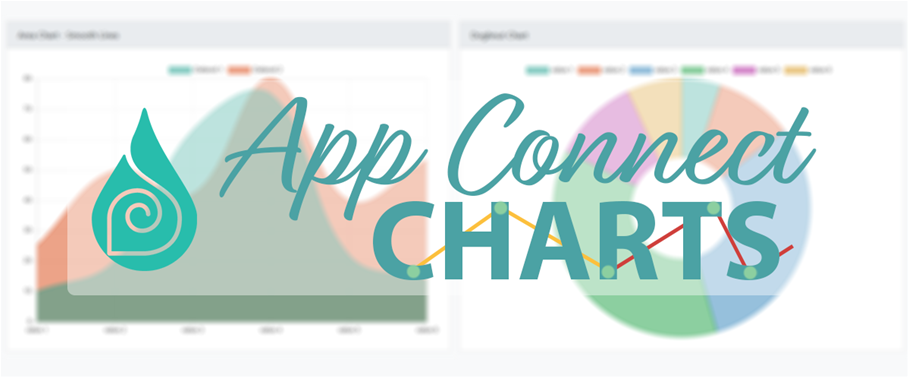
It’s time to release the long-awaited App Connect Charts – a brand new and powerful way to visualize data using awesome charts! You can choose from line, bar, radar, pie, polar area, horizontal bar, doughnut or area graphics and win users’ attention to the old-fashioned raw data!
Every data dashboard, a simple illustrated article or just an interactive application could now turn into really beautiful projects with awesome UX/UI performance! Read more on App Connect Charts' product page.
Check the showcases and usage videos below!
Of course, 11% release discount is applied and you can get the extension on that special price until Monday, October 30th.
 If we should describe Boris with one word, he is a digital enthusiast with broader experience in frontend web development using modern technologies - HTML5, CSS3, JavaScript (ES6, jQuery, Angular.js), PHP. He is part of DMXzone and contributing to the community as one of you.
Comments
Be the first to write a comment
You must me logged in to write a comment.